資訊人權貴 喜歡 Nov 21, 2021 02:33AM 準備下學期的(國際班)課程「資料視覺化」的時候,找到超讚的蒐集全球各種數據資料的網站「Our World in Data」。 例如這張圖看起來就很開心:為什麼大家喜歡臺灣討厭中國? World Map of the Freedom of the Press Status

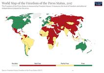 World Map of the Freedom of the Press Status
  World Map of the Freedom of the Press Status World Map of the Freedom of the Press Status